Antwyn Jackson


CCSQ SUpport Central
A digital support experience shaped by research, collaboration, and real-world need.
Project Overview
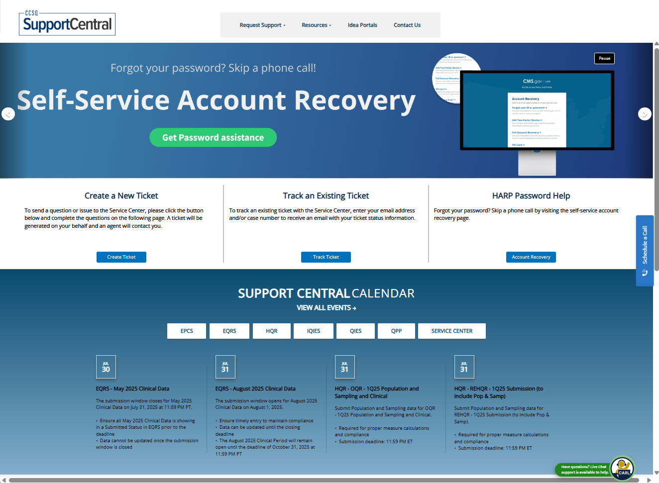
The primary goal of Support Central was to create a centralized, user-friendly platform where customers could:
- Submit support tickets
- Track the status of submitted tickets — without needing to call in
In addition to this core functionality, the site aimed to:
- Reduce call volume by supporting self-service options
- Provide multiple support channels (email, chat, Slack, phone)
- Increase customer satisfaction by making help accessible, transparent, and timely
Who was it for?
Support Central was created for both internal and external users who interact with the Centers for Medicare & Medicaid Services (CMS) — including program participants, vendors, Service Center teams, and CMS staff. It serves as a unified support platform for issue resolution, information access, and contact channel guidance.
What problem were you solving?

Previously, users had no easy way to submit tickets, check their status, or get help without calling the Service Center. This led to:
- Overwhelmed support lines
- Users repeating effort or waiting on hold
- Limited visibility into existing issues or upcoming updates
There was no centralized, digital-first support experience — just static program pages and disconnected workflows.
Goal

What I Owned
- User Research: Internal/external interviews, workshops, surveys, and ethnographic studies
- UX Design: Personas, user flows, site maps, wireframes, content hierarchies
- UI Design: High-fidelity mockups, branded components, interactive prototypes
- Testing: Moderated usability tests, 508 compliance validation, iterative surveys
- Design Ops: Dev-ready handoffs, stakeholder walkthroughs, ongoing iteration strategy

What I Collaborated On
- Other designers and researchers
- Product managers, scrum masters, and dev managers
- Frontline Service Center staff (reps, leads, QA)
- CMS program directors and policy leads
Tools, Timeline & Collaborators
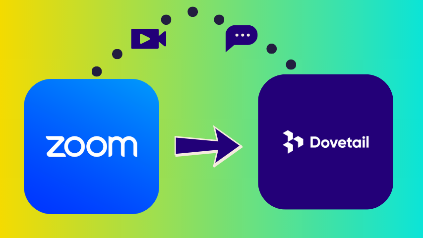
- Tools: Adobe XD, Figma, Miro, Dovetail, Qualtrics, Zoom, Datadog
- Timeline: January 2020 – Present
- Collaborators: UX/design team, CMS leadership, developers, support operations, vendor teams
The Process

Design
Validation
Quantitative and Qualitative
We used a mix of qualitative and quantitative methods to understand our users:
- Internal/external interviews
- Workshops across stakeholder groups
- Surveys and ethnographic field studies
- Usability testing with varied personas and program teams
Insights
We uncovered three critical needs:
- Easy access to accurate information
- Simple, intuitive navigation
- Clear paths to escalation and resolution
We converted insights into action through:
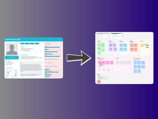
- Personas that reflected technical skill diversity
- Site maps and user flows that simplified key journeys
- Prioritized MVP features based on support frequency and urgency
All decisions were tied to CMS business goals: call deflection, user empowerment, and 508 compliance. This alignment ensured we could launch with impact while building space for future growth.
Research
Synthesis
Design
Validation
Design
Validation
Sticking to the plan
A design that prioritized the minimum viable product, while keeping options open for features to be added later.

Scalable and on-brand
Scalable UI patterns compliant with CMS standards.
Meeting user needs
Features like a calendar, FAQ hub, and streamlined contact directory
The Result
A clean, scalable, and accessible interface that reflected both user needs and enterprise constraints.
We learned to account for a wide range of tech literacy — and we updated flows, labels, and tooltips to reduce burden and increase clarity. . As feedback came in, we iterated quickly — tying every change to either a user insight or a CMS program goal.
508 testing using certified government supported tools

Persona-based usability testing

In-line and post-resolution surveys to track user sentiment

Design
Validation
Balancing usability, constraints, and CMS norms to build a support system that works.
Challenging the Norms
We pushed beyond the standard CMS playbook by:
- Adding a central calendar for key support dates
- Introducing a live FAQ system to deflect tickets before submission
These were uncommon on other CMS program sites, but survey feedback proved they were some of the most useful features we added.
Making the Right Tradeoffs
Instead of launching with everything at once, we narrowed our focus to an MVP scope, backed by:
- A phased roadmap
- A lean content model
- Measured, timed releases that aligned with CMS comms strategies
This approach helped reduce dev strain while keeping the user experience stable and intentional.
Pivotal Decisions
Two choices shaped the project:
- Making the site unauthenticated — allowing users to get help without logging in
- Aligning dev sprint capacity with the CMS program roadmap, ensuring MVP delivery without compromising future scalability
User Voices
Here’s what people said about the product
“Support Central is such a time-saver. The ability to track my tickets in real time without calling is amazing.”

Physician Staff
QPP
“I love the ability to see the calendar dates. It’s so hard to find that information across CMS sites — this fixes that.”

Physician
HQR
“Rather than having to make time to call in, I’m able to do things at my own pace. It greatly decreases time spent troubleshooting.”

Admin
IQIES
- Other CMS teams began adopting research and testing practices modeled after Support Central
- Design teams across the agency asked for readouts and lessons learned
- We elevated the standard for what flexible, user-first support could look like in a federal context
Growth isn’t just about outcomes — it’s about evolving your approach.
If we had a do-over, I’d push for earlier MVP alignment — not just with the design team, but with leadership and dev. That would’ve streamlined our scoping conversations and prevented avoidable churn early on.
Lessons Learned
We learned firsthand: test new tools before rolling them out.Delays caused by scheduling friction with Doodle could’ve been avoided with a simple pre-flight.
Next Time, I’d Try…
- More collaborative input tools (e.g. Miro/FigJam) for live stakeholder feedback
- Shifting from “scribe mode” to co-creation — empowering SMEs to contribute directly during planning
Advice to Future Teams
“Think outside the government box. The worst they can say is no — so try it.”Sometimes the most impactful features are the ones that seem unconventional. Don’t be afraid to prototype, test, and pitch bold ideas.

Antwyn Jackson
CCSQ SUpport Central
A digital support experience shaped by research, collaboration, and real-world need.
Project Overview
The primary goal of Support Central was to create a centralized, user-friendly platform where customers could:
- Submit support tickets
- Track the status of submitted tickets — without needing to call in
In addition to this core functionality, the site aimed to:
- Reduce call volume by supporting self-service options
- Provide multiple support channels (email, chat, Slack, phone)
- Increase customer satisfaction by making help accessible, transparent, and timely
Who was it for?
Support Central was created for both internal and external users who interact with the Centers for Medicare & Medicaid Services (CMS) — including program participants, vendors, Service Center teams, and CMS staff. It serves as a unified support platform for issue resolution, information access, and contact channel guidance.
What problem were you solving?
Previously, users had no easy way to submit tickets, check their status, or get help without calling the Service Center. This led to:
- Overwhelmed support lines
- Users repeating effort or waiting on hold
- Limited visibility into existing issues or upcoming updates
There was no centralized, digital-first support experience — just static program pages and disconnected workflows.
Goal
What I Owned
- User Research: Internal/external interviews, workshops, surveys, and ethnographic studies
- UX Design: Personas, user flows, site maps, wireframes, content hierarchies
- UI Design: High-fidelity mockups, branded components, interactive prototypes
- Testing: Moderated usability tests, 508 compliance validation, iterative surveys
- Design Ops: Dev-ready handoffs, stakeholder walkthroughs, ongoing iteration strategy
What I Collaborated On
- Other designers and researchers
- Product managers, scrum masters, and dev managers
- Frontline Service Center staff (reps, leads, QA)
- CMS program directors and policy leads
Tools, Timeline & Collaborators
- Tools: Adobe XD, Figma, Miro, Dovetail, Qualtrics, Zoom, Datadog
- Timeline: January 2020 – Present
- Collaborators: UX/design team, CMS leadership, developers, support operations, vendor teams
The Process
Research
Synthesis
Design
Validation
Quantitative and Qualitative
We used a mix of qualitative and quantitative methods to understand our users:
- Internal/external interviews
- Workshops across stakeholder groups
- Surveys and ethnographic field studies
- Usability testing with varied personas and program teams
Insights
We uncovered three critical needs:
- Easy access to accurate information
- Simple, intuitive navigation
- Clear paths to escalation and resolution
We converted insights into action through:
- Personas that reflected technical skill diversity
- Site maps and user flows that simplified key journeys
- Prioritized MVP features based on support frequency and urgency
All decisions were tied to CMS business goals: call deflection, user empowerment, and 508 compliance. This alignment ensured we could launch with impact while building space for future growth.
Research
Synthesis
Design
Validation
Research
Synthesis
Design
Validation
Sticking to the plan
A design that prioritized the minimum viable product, while keeping options open for features to be added later.
Scalable and on-brand
Scalable UI patterns compliant with CMS standards.
Meeting user needs
Features like a calendar, FAQ hub, and streamlined contact directory
The Result
A clean, scalable, and accessible interface that reflected both user needs and enterprise constraints.
We learned to account for a wide range of tech literacy — and we updated flows, labels, and tooltips to reduce burden and increase clarity. . As feedback came in, we iterated quickly — tying every change to either a user insight or a CMS program goal.
508 testing using certified government supported tools
Persona-based usability testing
In-line and post-resolution surveys to track user sentiment
Research
Synthesis
Design
Validation
Balancing usability, constraints, and CMS norms to build a support system that works.
Challenging the Norms
We pushed beyond the standard CMS playbook by:
- Adding a central calendar for key support dates
- Introducing a live FAQ system to deflect tickets before submission
These were uncommon on other CMS program sites, but survey feedback proved they were some of the most useful features we added.
Making the Right Tradeoffs
Instead of launching with everything at once, we narrowed our focus to an MVP scope, backed by:
- A phased roadmap
- A lean content model
- Measured, timed releases that aligned with CMS comms strategies
This approach helped reduce dev strain while keeping the user experience stable and intentional.
Pivotal Decisions
Two choices shaped the project:
- Making the site unauthenticated — allowing users to get help without logging in
- Aligning dev sprint capacity with the CMS program roadmap, ensuring MVP delivery without compromising future scalability
“Support Central is such a time-saver. The ability to track my tickets in real time without calling is amazing.”
Physician Staff
QPP
“I love the ability to see the calendar dates. It’s so hard to find that information across CMS sites — this fixes that.”
Physician
HQR
“Rather than having to make time to call in, I’m able to do things at my own pace. It greatly decreases time spent troubleshooting.”
Admin
IQIES
- Other CMS teams began adopting research and testing practices modeled after Support Central
- Design teams across the agency asked for readouts and lessons learned
- We elevated the standard for what flexible, user-first support could look like in a federal context
Growth isn’t just about outcomes — it’s about evolving your approach.
If we had a do-over, I’d push for earlier MVP alignment — not just with the design team, but with leadership and dev. That would’ve streamlined our scoping conversations and prevented avoidable churn early on.
Lessons Learned
We learned firsthand: test new tools before rolling them out.Delays caused by scheduling friction with Doodle could’ve been avoided with a simple pre-flight.
Next Time, I’d Try…
- More collaborative input tools (e.g. Miro/FigJam) for live stakeholder feedback
- Shifting from “scribe mode” to co-creation — empowering SMEs to contribute directly during planning
Advice to Future Teams
“Think outside the government box. The worst they can say is no — so try it.”Sometimes the most impactful features are the ones that seem unconventional. Don’t be afraid to prototype, test, and pitch bold ideas.
Antwyn Jackson
CCSQ SUpport Central
A digital support experience shaped by research, collaboration, and real-world need.
Project Overview
Who was it for?
Support Central was created for both internal and external users who interact with the Centers for Medicare & Medicaid Services (CMS) — including program participants, vendors, Service Center teams, and CMS staff. It serves as a unified support platform for issue resolution, information access, and contact channel guidance.
What problem were you solving?
Previously, users had no easy way to submit tickets, check their status, or get help without calling the Service Center. This led to:
- Overwhelmed support lines
- Users repeating effort or waiting on hold
- Limited visibility into existing issues or upcoming updates
There was no centralized, digital-first support experience — just static program pages and disconnected workflows.
Goal
The primary goal of Support Central was to create a centralized, user-friendly platform where customers could:
- Submit support tickets
- Track the status of submitted tickets — without needing to call in
In addition to this core functionality, the site aimed to:
- Reduce call volume by supporting self-service options
- Provide multiple support channels (email, chat, Slack, phone)
- Increase customer satisfaction by making help accessible, transparent, and timely
What I Owned
- User Research: Internal/external interviews, workshops, surveys, and ethnographic studies
- UX Design: Personas, user flows, site maps, wireframes, content hierarchies
- UI Design: High-fidelity mockups, branded components, interactive prototypes
- Testing: Moderated usability tests, 508 compliance validation, iterative surveys
- Design Ops: Dev-ready handoffs, stakeholder walkthroughs, ongoing iteration strategy
What I Collaborated On
- Other designers and researchers
- Product managers, scrum masters, and dev managers
- Frontline Service Center staff (reps, leads, QA)
- CMS program directors and policy leads
Tools, Timeline & Collaborators
- Tools: Adobe XD, Figma, Miro, Dovetail, Qualtrics, Zoom, Datadog
- Timeline: January 2020 – Present
- Collaborators: UX/design team, CMS leadership, developers, support operations, vendor teams
The Process
Research
Synthesis
Design
Validation
Quantitative and Qualitative
We used a mix of qualitative and quantitative methods to understand our users:
- Internal/external interviews
- Workshops across stakeholder groups
- Surveys and ethnographic field studies
- Usability testing with varied personas and program teams
Insights
We uncovered three critical needs:
- Easy access to accurate information
- Simple, intuitive navigation
- Clear paths to escalation and resolution
We converted insights into action through:
- Personas that reflected technical skill diversity
- Site maps and user flows that simplified key journeys
- Prioritized MVP features based on support frequency and urgency
All decisions were tied to CMS business goals: call deflection, user empowerment, and 508 compliance. This alignment ensured we could launch with impact while building space for future growth.
Research
Synthesis
Design
Validation
Research
Synthesis
Design
Validation
Sticking to the plan
A design that prioritized the minimum viable product, while keeping options open for features to be added later.
Scalable and on-brand
Scalable UI patterns compliant with CMS standards.
Meeting user needs
Features like a calendar, FAQ hub, and streamlined contact directory
The Result
A clean, scalable, and accessible interface that reflected both user needs and enterprise constraints.
We learned to account for a wide range of tech literacy — and we updated flows, labels, and tooltips to reduce burden and increase clarity. . As feedback came in, we iterated quickly — tying every change to either a user insight or a CMS program goal.
508 testing using certified government supported tools
Persona-based usability testing
In-line and post-resolution surveys to track user sentiment
Research
Synthesis
Design
Validation
Balancing usability, constraints, and CMS norms to build a support system that works.
Challenging the Norms
We pushed beyond the standard CMS playbook by:
- Adding a central calendar for key support dates
- Introducing a live FAQ system to deflect tickets before submission
These were uncommon on other CMS program sites, but survey feedback proved they were some of the most useful features we added.
Making the Right Tradeoffs
Instead of launching with everything at once, we narrowed our focus to an MVP scope, backed by:
- A phased roadmap
- A lean content model
- Measured, timed releases that aligned with CMS comms strategies
This approach helped reduce dev strain while keeping the user experience stable and intentional.
Pivotal Decisions
Two choices shaped the project:
- Making the site unauthenticated — allowing users to get help without logging in
- Aligning dev sprint capacity with the CMS program roadmap, ensuring MVP delivery without compromising future scalability
“Support Central is such a time-saver. The ability to track my tickets in real time without calling is amazing.”
Physician Staff
QPP
“I love the ability to see the calendar dates. It’s so hard to find that information across CMS sites — this fixes that.”
Physician
HQR
“Rather than having to make time to call in, I’m able to do things at my own pace. It greatly decreases time spent troubleshooting.”
Admin
IQIES
- Other CMS teams began adopting research and testing practices modeled after Support Central
- Design teams across the agency asked for readouts and lessons learned
- We elevated the standard for what flexible, user-first support could look like in a federal context
Growth isn’t just about outcomes — it’s about evolving your approach.
If we had a do-over, I’d push for earlier MVP alignment — not just with the design team, but with leadership and dev. That would’ve streamlined our scoping conversations and prevented avoidable churn early on.
Lessons Learned
We learned firsthand: test new tools before rolling them out.Delays caused by scheduling friction with Doodle could’ve been avoided with a simple pre-flight.
Next Time, I’d Try…
- More collaborative input tools (e.g. Miro/FigJam) for live stakeholder feedback
- Shifting from “scribe mode” to co-creation — empowering SMEs to contribute directly during planning
Advice to Future Teams
“Think outside the government box. The worst they can say is no — so try it.”Sometimes the most impactful features are the ones that seem unconventional. Don’t be afraid to prototype, test, and pitch bold ideas.
Antwyn Jackson